The purpose of this page is to deal with fonts, but only briefly. TeX came originally with Computer Modern Fonts, which are defined and created by the program Metafont. But nowadays Metafont rasterizations (fonts for rendering/printing) are being replaced by Postscript fonts. (It should be remembered that everything that's demonstrated here could probably be done in many ways beside how it's shown here.)
Since this LaTeX series is meant for beginners, I should point out that if your TeX work is to be submitted to a publisher, that company/university may have its own preferred font standards to follow.
The default font size in a LaTeX paper is 10pt or 10 points in height. To assign a different font height when invoking the document type, use this (my example is with the 'article' style)
\documentclass[N]{article}
where N is the point size with appropriate unit included. So, for example, to get 12 point fonts by default, use
\documentclass[12pt]{article}
In my early days of TeX, I used primitive commands like
\mathchardef\btimes="7502to define my own versions of characters, but these days there are more elegant ways to get at the characters we want. But I included it here for completeness. Who knows, the \mathchardef command may still be of use to the typical user for some unusual cases. By the way, the double quote means that what follows will be interpreted as a hexadecimal number.
\mathchardef\reals="723C
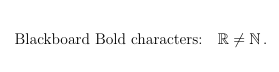
It is standard in mathematics literature to use Blackboard bold fonts to reference common number sets, such as the integers, the reals, etc. Use the following definitions to get Blackboard Bold characters (uses package dsfont):
\newcommand{\bbR}{{\mathbb R}}The other letters follow similarly. Examples below:
\newcommand{\bbN}{{\mathbb N}}
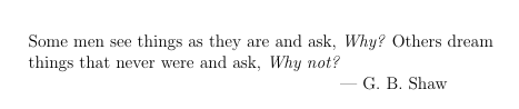
One can use '\it' or '\bf' within a closed environment to force the italic version or he boldface version of your font. Example following:
Some men see things as they are and ask, {\it Why?} Others dream \par
things that never were and ask, {\it Why not?} \par
--- G. B. Shaw
Which will look like:
If you want to retain use of Computer Modern Fonts, you can define them yourself, in various convenient sizes:
\font\sixrm=cmr6
\font\sevenrm=cmr7
\font\eightrm=cmr8
\font\ninerm=cmr9
\font\tenrm=cmr10
\font\twelverm=cmr12
\font\nineit=cmmi9
etc
One reason I found it convenient to define eightrm font was to use a roman T
as the symbol of correct size and font to indicate the
transpose of a matrix. Example following:
![]()
The definition I used was:
\newcommand{\expoT}{{\hbox{\eightrm T}}} (Notice how many curly braces I used to get it right.)
and coded as 'M = M^\expoT'.
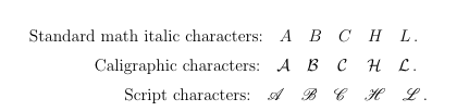
Caligraphic fonts can be defined as follows:
\newcommand{\calA}{{\cal A}}
\newcommand{\calB}{{\cal B}}
\newcommand{\calC}{{\cal C}}
\newcommand{\calH}{{\cal H}}
\newcommand{\calL}{{\cal L}}
For the longest time, the TeX community had to make due with caligraphic fonts. But now
we have access to real scriptstyle fonts, such as (use package 'mathrsfs'):
\newcommand{\scrA}{{\mathscr A}}
\newcommand{\scrB}{{\mathscr B}}
\newcommand{\scrC}{{\mathscr C}}
\newcommand{\scrH}{{\mathscr H}}
\newcommand{\scrL}{{\mathscr L}}
The following graphic displays the distinction among regular math italic fonts,
caligraphic fonts, and scriptstyle fonts:
To change the size of characters both in and out of math mode, try the commands:
\tiny \scriptsize \footnotesize \normalsize
\large \Large \LARGE \huge \Huge
There follows an example (with code) between the smaller fonts I defined above and the use of 'scriptsize':
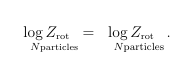
\begin{equation} \underset{\quad N \mbox{\sevenrm particles}}{\log Z_{\mbox{\sevenrm rot}}}
= \underset{\quad N \mbox{\scriptsize particles}}{\log Z_{\mbox{\sevenrm rot}}}\,.
\end{equation}
Normally it's very easy to get the correct font size in a subscript while in math mode,
so long as you want the subscripted letter to be in math italic. But if you want the
subscripts to be otherwise, such as just an unitalicized font, then a little extra effort
is required, especially if there is to be a bar over the letter
:
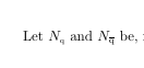
The LaTeX code I used for this begins with '\font\sixrm=cmr6' in the
header, and then in the body of the file:
\def\obq{\overline{\hbox{\sixrm q}}}\Let $ N_{\mbox{\tiny q}}$ and $ N_{\hbox{$\obq$}}$ be,
Some of these commands I know from PlainTeX. I really couldn't say if there's an
easier way to code this.
Sometimes you want a font that has a fixed with to it (monospaced). Most fonts kern
their letters to remove unsightly 'extra' space between characters. So, the usual
roman font, for example, for LaTeX would produce a vertical list like this:
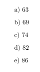
by using the following code (where '\no' is short for '\noindent'):
\no a) 63
\vskip.1in
\no b) 69
\vskip.1in
\no c) 74
\vskip.1in
\no d) 82
\vskip.1in
\no e) 86
Whereas, if I tell LaTeX to use a fixed-width font instead, like '\tt',
I can get the better looking result:
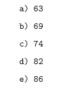
using the code:
{\tt
\no a) 63
\vskip.1in
\no b) 69
\vskip.1in
\no c) 74
\vskip.1in
\no d) 82
\vskip.1in
\no e) 86
}
Similar to '\tt' is '\texttt{....}, but I have found the former to work better
when including carriage returns (new lines). I believe that the font used in
either of these cases is called Courier Font.